The academic face of Gdansk and strong ties with the sea, respect for tradition, but also modernity - this is how the new logo of the University of Gdansk can be summed up in a nutshell. From June 1, 2021, it will replace the existing emblem of the university. Work on the new logo lasted several months and was preceded by a closed competition with the participation of recognised design studios, consultations at Senate meetings and a discussion among experts - graphic designers specialising in graphic identification.
During the 50 years of the University of Gdansk's existence, the necessity to change its logo was mentioned several times. Such an attempt was made, for example, during the celebrations of the 35th anniversary of the University of Gdansk, when a sail motif appeared on the Faculty of Philology building, which was to be a precursor of the new emblem. In connection with the commencement of the celebrations of the 50th anniversary of the university, a sign based on a shield referring to the coat of arms of Gdansk with the dates of the establishment of the university and the jubilee year was approved to replace the existing logo after the anniversary. However, the process was not widely consulted and decisions were taken without consulting such important bodies as the UG Senate or the University Council.
In March this year, the anniversary celebrations of the University of Gdansk came to an end. As the Rector, prof. dr hab. Piotr Stepnowski emphasised on many occasions, this closing meant at the same time the opening of another, completely new chapter in the history of our University. Therefore, if there was to be a so-called rebranding, i.e. a change of the signet and typography of the logotype, the development of a new visual identification book and other standards for the graphic communication of the university, this process had to be conducted as professionally and transparently as possible.
- 'The 50th anniversary of our university is indeed an excellent time to develop and implement a new visual identity for the University. The existing, very outdated logotype, which does not follow the rules of logo functioning in graphic, digital and various formats, the lack of clear guidelines of the so-called book of the logo, the confusion in using it with other graphic elements, forces us to develop a completely new strategy of visual identification of the UG logo, adequate to the contemporary challenges,' says Rector prof. Piotr Stepnowski.
In February this year, the UG Senate appointed a Team for the design of a new emblem of the University of Gdansk, consisting of prof. Krzysztof Polkowski (Rector of the Academy of Fine Arts), dr. Adam Świerżewski (Vice-Rector of the Academy of Fine Arts, a specialist in graphic identification), prof. UG Aneta Oniszczuk - Jastrząbek (Director of the UG Centre for Communication and Promotion). The team also engaged two additional experts: prof. Jan Buczkowski (Head of the Department of Visual Arts, PG) and mgr. Patryk Hardziej ( Department)of Graphic Design, Academy of Fine Arts).
The experts gave their opinions on the submitted proposals and helped to select the directional logo. The process was divided into two stages - the first stage consisted of organising a closed competition, in which several graphic design studios with recognised reputation and achievements in logo design were invited to participate. These were five companies: Tatastudio, BrandScope, TOFU, Studio Spectro and Wojtek Radtke Studio.
- 'Visual identification is not only the main logo but first of all, it is a unitary, tailored, developed system of graphic elements, which visually communicate the intended message. Corporate identity is one of the strategic elements of the whole, which is the image of a given institution. Visual identification must be built appropriately. Design offices that specialise in building the image of brands and have significant implementations in this area in their portfolio have been invited to the closed competition,' - says team member, dr Adam Świerżewski.
- 'During the presentation of the first proposals of the new logo, the Senate became acquainted not only with the proposals selected by the team but also with the implementation of the logo, i.e. using it in various graphic forms,' - emphasises dr hab. inż. Aneta Oniszczuk - Jastrząbek, prof. UG, the Director of the Communication and Promotion Centre.
After initial consultations, the Senators chose one of the proposed signs as the directional proposal for the target UG logo. The winning Spectro Studio then incorporated the suggested amendments and corrections and presented the final version of the logo agreed with the team of experts at the next meeting of the Senate.
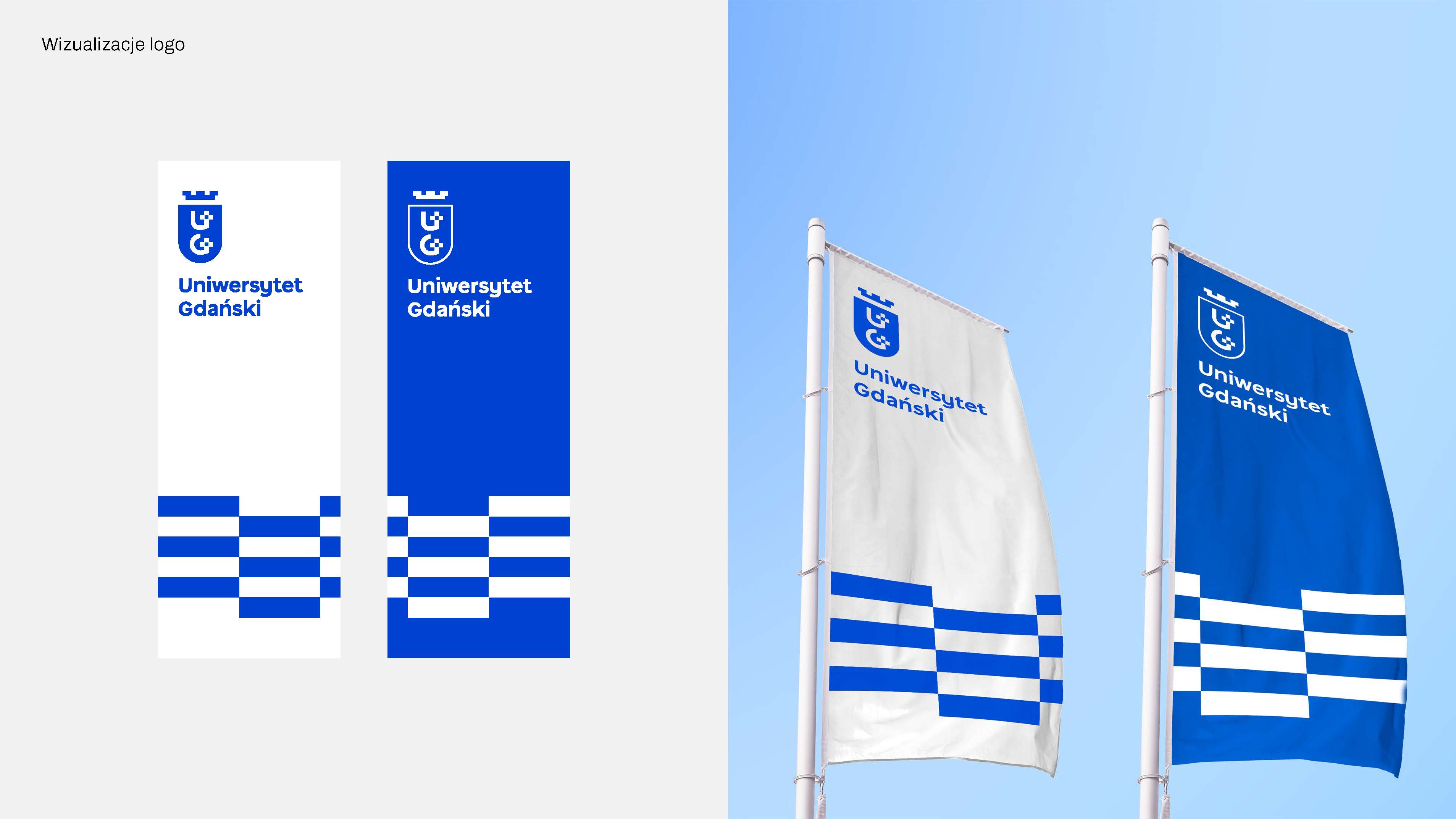
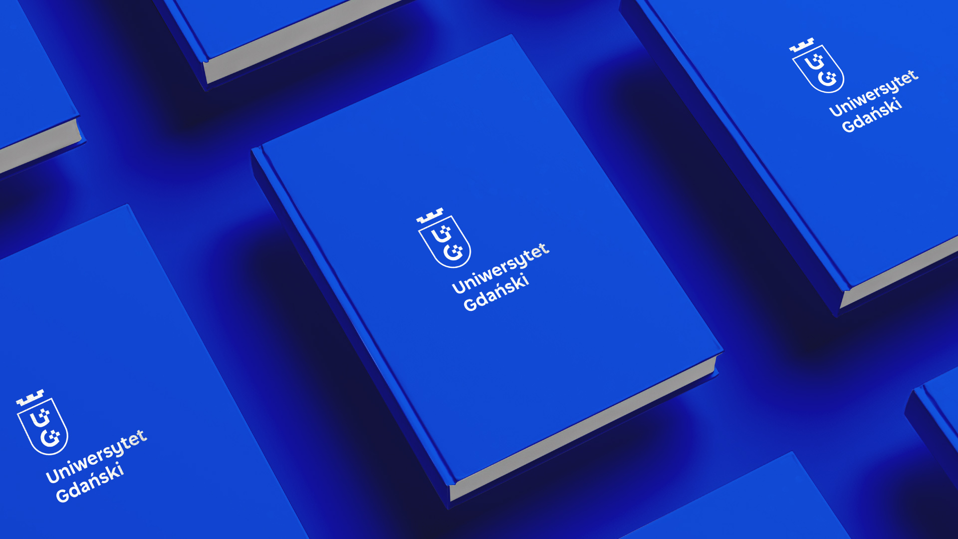
- 'When preparing the proposal for the logo design, we mainly followed the guidelines from the brief presented to us. The new logo has been designed in such a way as to meet several assumptions, among others it presents the University as a strong and progressive academic centre and, by its form and aesthetic idea, it makes it possible to organise the visual language of the University,' - explains Gabriela Kozikowska, project manager at Studio Spectro. - 'The main guidelines for the design were based on the heraldry of the city of Gdansk (two crosses), legible letters "U" and "G", and colours referring to the marine character. It was also very important to design the logo in such a way that it would look good on a small scale, e.g. on a business card, as well as in the form of a large sign on a building.'
- 'Our idea to create a concept corresponding to the needs of the University was to use modern and legible typography, a strong, progressive colour (intensive ultramarine colour) and an aesthetic and functional combination of the first letters of the name of the University with two vertical crosses on a modular grid. We also applied the negative space treatment here, which gives the sign additional depth and provides the basis for building an interesting and timeless visual language,' - adds Małgorzata Macioch, owner and Art Director of Studio Spectro.
It is also interesting that the creators of the new UG logo used an unusual colour. It refers to the traditional university navy blue but is fresh and more modern.
- 'The whole thing will be a very important element in building the university's new identity,' stressed dr Adam Świerżewski.
The new identity was approved by the Senate with a vast majority of votes (48 in favour, 4 against, 3 abstentions) and unanimously endorsed by the University Council.
- 'Currently, work is underway to implement the design into the University's new Brand Manual, which will become the reference document for all forms of visual identification of the University of Gdansk,'- says Rector prof. Piotr Stepnowski.
See a video about the new University of Gdansk logo: https://youtu.be/pEzhR56rYqY.